SPELLING & GRAMMAR
The festival prefers that for branding and spelling purposes it be written out and referred to as one word: FilmQuest
The F and Q are both capitalized, with “Film” and “Quest” written out as one word with no space in between.
LOGO STYLE GUIDE & INFO
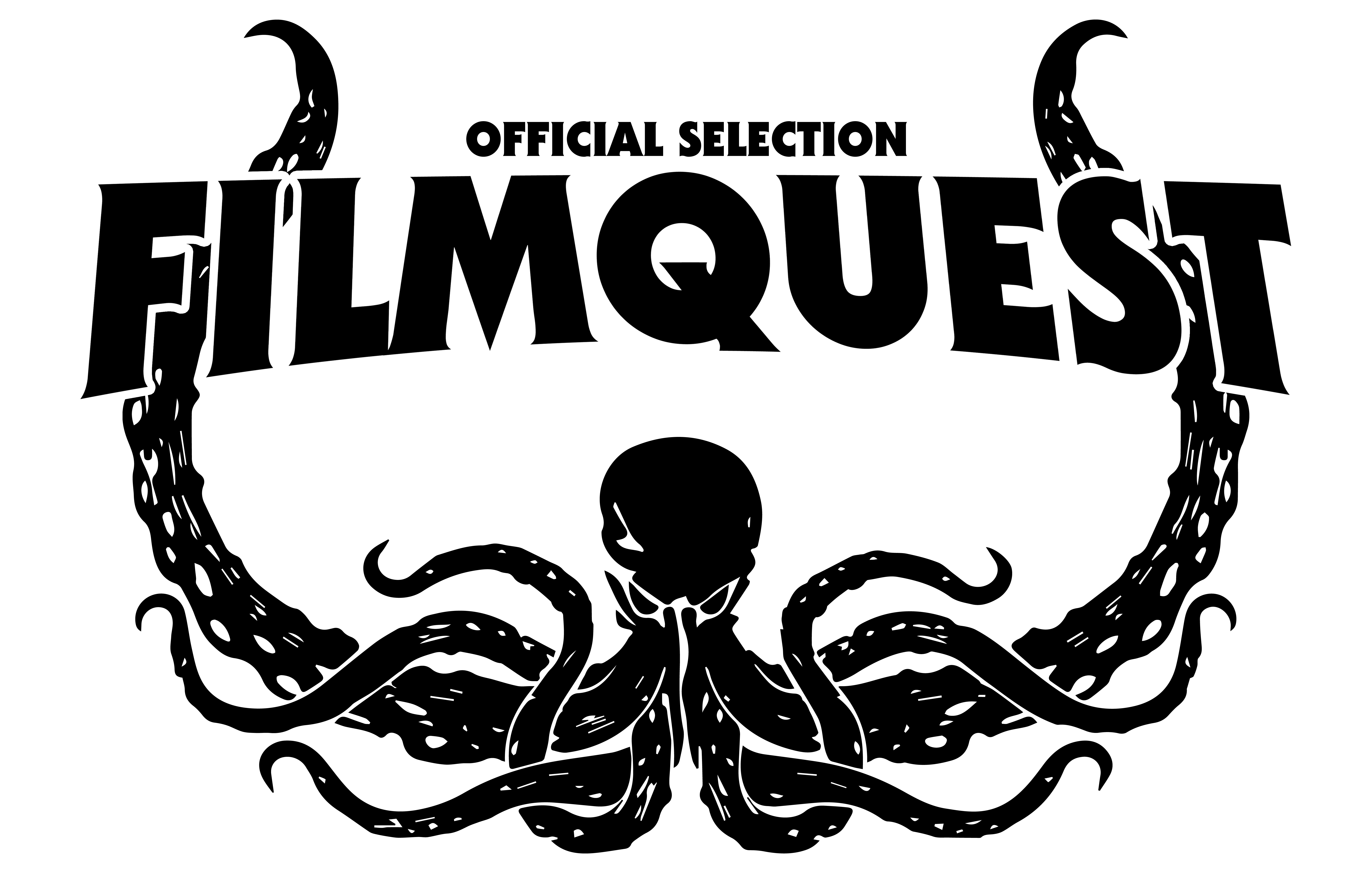
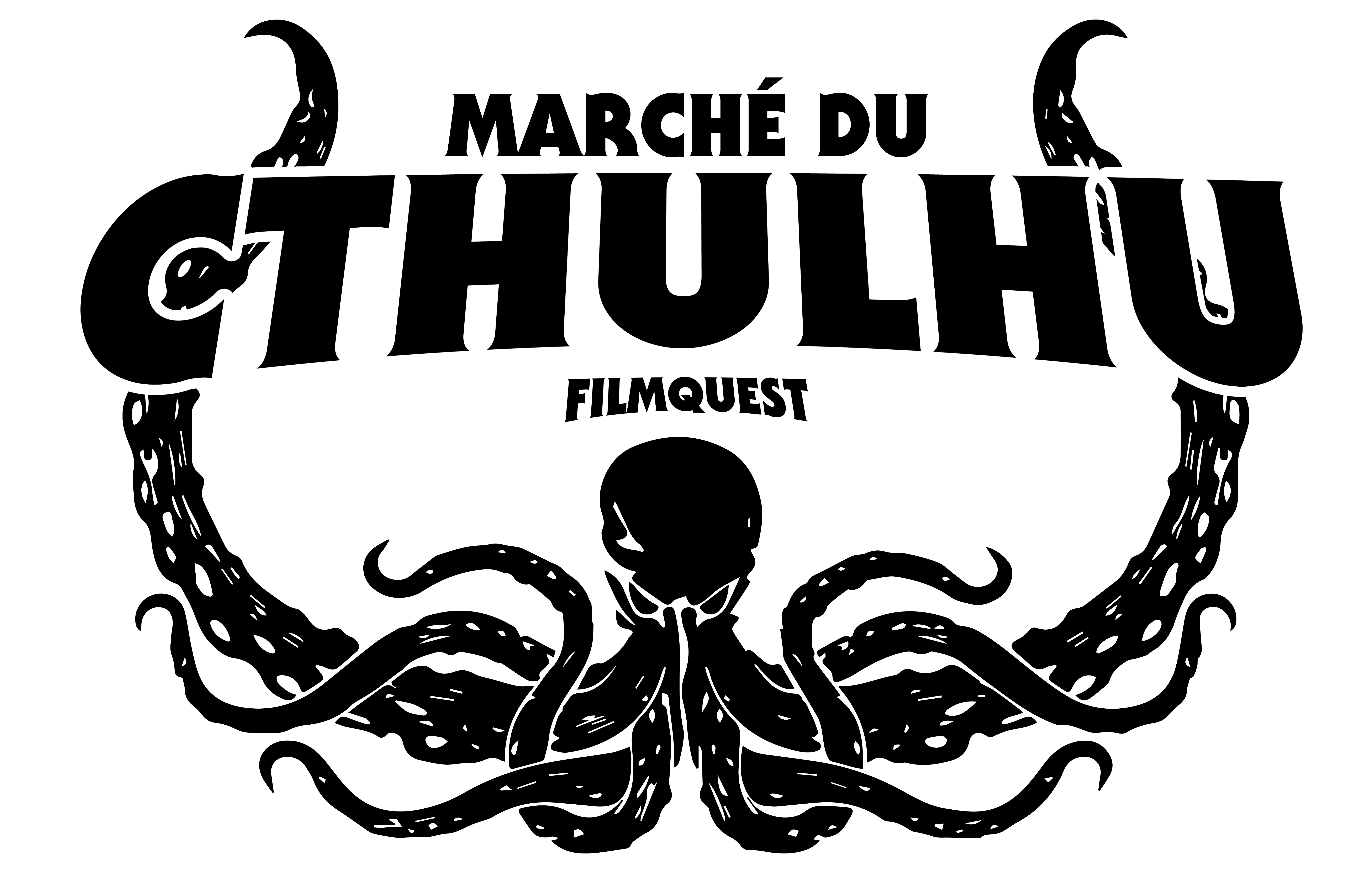
Below can be found a black version of FilmQuest’s official logo in full, which includes both the Cthulhu “head” logo and wordmark, the solo wordmark logo, and the solo Cthulhu “head” logo. The festival’s Official Selection laurels and Marché du Cthulhu laurels can also be found below.
We ask that for press, media, and branding purposes that none of these logos be modified in any way outside of a color overlay (such as white, red, pink, purple, green, gold, etc.), or simple shadowing, outlines, etc. unless given the express written permission by FilmQuest to do so. The festival has no “official” colors, and we encourage users of the logo to be colorful and creative with the depiction of the the logo for their promotional needs.
The FilmQuest logo and laurels were initially created by Bulgarian artist Julieta Koleva in 2014. For the festival’s 10th anniversary in 2023, Julieta updated the logo and laurels with a refreshed, cleaner and bolder look to its current design, while festival founder Jonathan Martin created the new wordmark to compliment the updated brand.
The Marché du Cthulhu logo was created in 2026 by Jonathan Martin incorporating the laurels designed by Julieta plus a custom word mark based on the festival’s current wordmark.
FONT INFO
FilmQuest’s fonts of choice are ITC Serif Gothic Std and SerifGothic LT Black and/or SerifGothic LT Light Regular. They are the same fonts that were used in the creation of the festival’s wordmark.